Digital Accessibility: When it comes to building Word documents accessible to blind and visually impaired students, knowing the right tools, techniques, and tech is a total game-changer. Accessibility in digital education isn’t just about ticking boxes or compliance—it’s about creating an equal learning environment where every student feels included and empowered to succeed. In this guide, you’ll learn how to format Word docs that work seamlessly with screen readers, offer easy navigation, and incorporate the latest assistive tech innovations. Whether you’re a teacher, content creator, or school admin, this straightforward guide breaks down everything you need to know with clear examples, practical advice, and trusted data.
Table of Contents
Digital Accessibility
Making Word documents accessible for blind and visually impaired students is more than a checklist; it’s a commitment to fairness, education equity, and inclusion in 2025 and beyond. Employ proper headings, alt text, readable fonts, and structured tables. Use Word’s tools and pair your efforts with the latest assistive technologies for an impactful learning experience that leaves no student behind.
| Aspect | Info & Tips |
|---|---|
| Use built-in heading styles | For logical structure that screen readers can navigate easily. |
| Add alt text for images | Describes visuals for screen readers; skip decorative ones. |
| Readable fonts & colors | Use sans-serif fonts, avoid all caps/italics, and maintain high color contrast. |
| Tables & lists best practices | Use simple tables with headers; keep lists properly formatted for screen reader access. |
| Keyboard navigation | Ensure keyboard shortcuts and navigation flow works smoothly for non-mouse users. |
| Check with Word Accessibility Checker | Identify and fix potential issues before sharing documents. |
| Use Read Aloud and Immersive Reader | Built-in tools to read content aloud and enhance user engagement. |
| Latest Assistive Tech | Wearables (AI glasses, haptic bands), Braille tech, and mobile AI apps enhance learning too. |
Why Digital Accessibility in Word Documents Matters?
Did you know there are over 7.6 million people in the U.S. with vision impairment or blindness? Many depend on screen readers or braille displays to access learning content. A poorly formatted document can trap them in confusion or frustration, blocking access to information everyone else takes for granted.
Accessibility standards like the Americans with Disabilities Act (ADA) require educational content to be inclusive—not simply to follow legal rules, but to create equal opportunities in education. Good accessibility practices help everyone, including those with mild vision issues, dyslexia, or temporary impairments caused by injury or illness.
Step-by-Step Guide: Making Word Docs Accessible for the Visually Impaired
1. Structure with Built-in Heading Styles
Using Word’s default heading styles (Heading 1, Heading 2, etc.) is the foundation of accessibility. Screen readers rely on these headings to enable users to jump quickly between sections or create an outline view that breaks a long document into manageable pieces.
- Use Heading 1 only once for the main title.
- Use Heading 2 for major sections, then Heading 3 and beyond for subsections.
- Avoid skipping heading levels as it confuses screen reader navigation.
Example: In a history lesson on the American Revolution, “American Revolution” is Heading 1, “Causes” and “Major Battles” are Heading 2, and “Boston Tea Party” is Heading 3.
2. Add Meaningful Alt Text to Images and Graphics
Screen readers can’t “see” images. They rely on alt text to describe the picture or diagram. Effective alt text is concise but descriptive, focusing on the key information the image conveys.
- Right-click an image and select Edit Alt Text.
- Avoid phrases like “image of” or “picture showing.”
- If an image is decorative (like background textures), mark it as decorative to skip.
Tip: For charts or graphs, consider also providing the underlying data in text form or summarizing important trends to provide context for blind users.
3. Choose Fonts and Colors for Maximum Readability
Fonts affect legibility more than you might think. Sans-serif fonts such as Arial, Verdana, and Calibri are recommended by accessibility experts for their clean lines. Use at least 14-16 point font sizes for body text, and larger for headings.
Avoid:
- Using all caps (it slows reading and feels like shouting online).
- Overuse of italics or script fonts (hard on the eyes).
- Conveying meaning using color alone—pair colors with text or patterns.
For color contrast, aim for a ratio of at least 4.5:1 between text and background.
4. Create Simple, Well-Organized Tables and Lists
Tables can be tricky for screen readers if not constructed properly. Use the built-in table functionality and specify header rows, so screen readers announce headers when reading table cells.
- Avoid merged or split cells which break navigation.
- Don’t leave empty cells that confuse content order.
- Use bullet and numbered lists correctly, not just symbols or manual spacing.
Example: A student using a screen reader navigating a table listing U.S. states and capitals hears: “Row 2, State: California, Capital: Sacramento” rather than random text strings.
5. Enable Full Keyboard Navigation
Blind users rely heavily on keyboards since mouse control is difficult or impossible. Check that your document supports tabbing through headings, links, and form fields efficiently.
Helpful Word shortcuts:
Alt + Qto open Search or Tell Me box.Ctrl + Alt + Spaceto activate Read Aloud.- Arrow keys for paragraph or word navigation.
Ctrl + Shift + Nto apply Normal style quickly.
6. Check Accessibility with Word’s Built-in Checker
Word’s Accessibility Checker hunts down missing alt text, color contrast issues, and other pitfalls. Using this tool before sharing your document saves frustration down the road.
- Find the checker under Review > Check Accessibility or search for Accessibility Checker.
- Pay attention to warnings and errors, and apply suggested fixes.
7. Use Read Aloud and Immersive Reader Features
Immersive Reader, built into Word, improves accessibility by offering reading assistance like line focus, changing page color, syllable highlighting, and reading speed controls.
Read Aloud converts text to speech, highlighting words as it reads, helpful for both proofreading and for students who benefit from auditory learning.
8. Incorporate the Latest Assistive Technologies
Assistive technology is constantly evolving. A few highlights for 2025 include:
- AI-Powered Glasses: Devices like Envision Glasses help students “see” by reading signs, text, and recognizing faces aloud.
- Haptic Feedback Wearables: Sensory bands provide vibrations to indicate direction, proximity, or alerts.
- Refreshable Braille Displays: Let users read digital content in braille, bridging the gap between tactile and visual content.
- Mobile Apps: Seeing AI, Be My Eyes, and Voice Dream Reader are apps that use AI to read text aloud or provide visual assistance.
- Advanced Screen Readers: JAWS, NVDA, and VoiceOver have added AI-driven contextual improvements for better comprehension.
Pair accessible Word documents with these tools for robust, inclusive learning experiences.

Real-World Example: An Accessible Science Worksheet
Imagine you’re prepping a worksheet on photosynthesis for middle school:
- Title the document with Heading 1: “Photosynthesis Basics.”
- Break into segments under Heading 2: “What is Photosynthesis?” and “Why Photosynthesis is Important.”
- Include a chloroplast diagram with alt text like: “Diagram of a chloroplast showing thylakoid, granum, and stroma.”
- Table lists raw materials: water, sunlight, carbon dioxide, formatted with headers.
- Keep text in Arial, black on white, ensuring high contrast.
- Bulleted list explains the photosynthesis steps.
- Double-check everything with the Accessibility Checker.
- Provide an audio version via Read Aloud for reviewing.

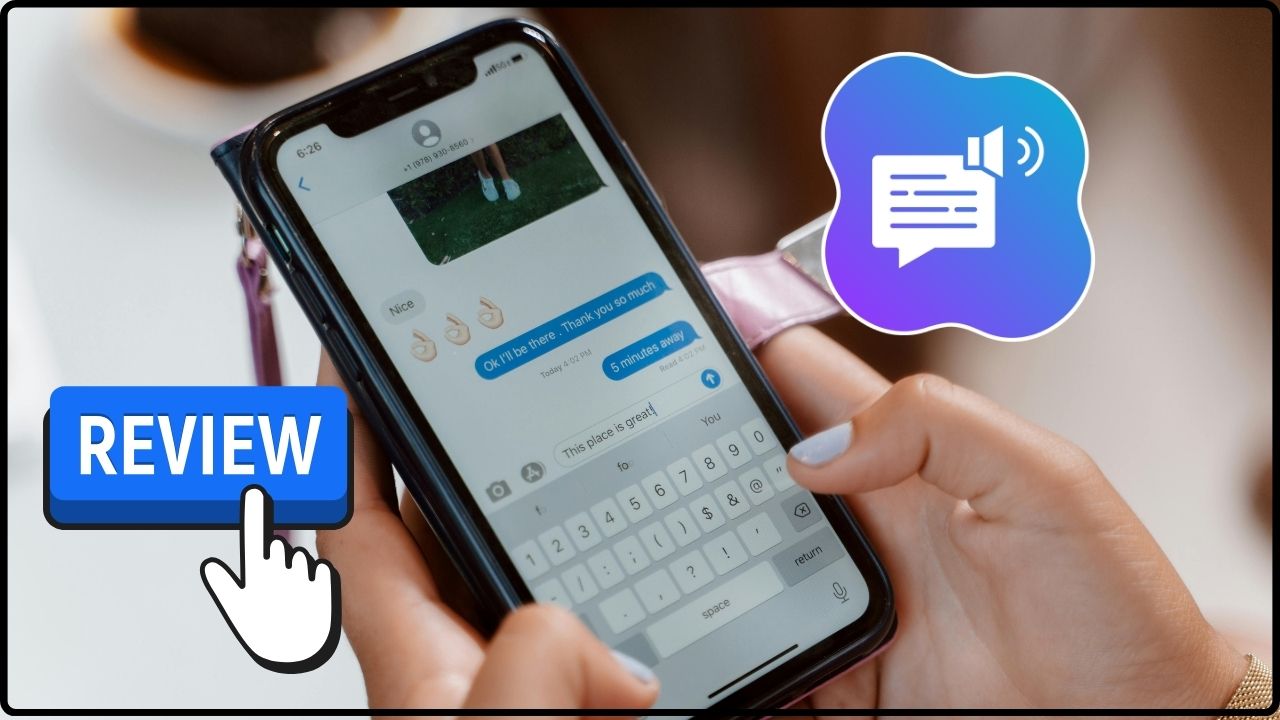
Review: Best Text-to-Speech Software for Serbian/Croatian Languages
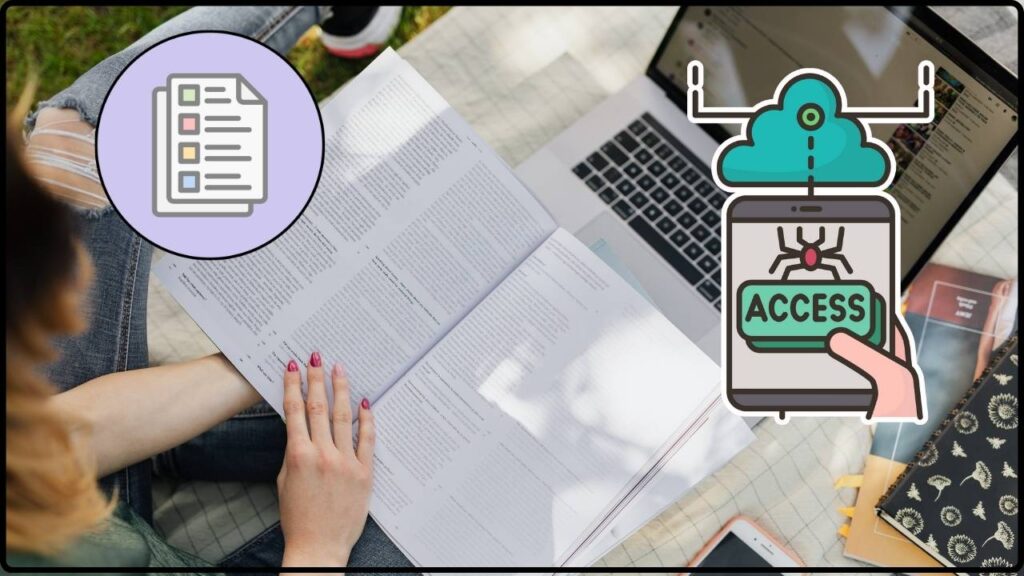
Assistive Technology Catalog: Where to Find Free and Subsidized Tools in Serbia
Erasmus+ for Inclusion: How to Write a Winning Project Proposal for Your School